Venn Diagrams (also known with the name Eulerian Circles) was first introduced by John Venn in 1880. Naturally, he did not call them Venn diagrams, but Eulerian Circles - named after Leonhard Euler who used similarly looking visual representations during the 18th century. Although the actual origin of the Venn Diagrams is questionable, their usage in modern days leaves no room for hesitation.
What are Venn diagrams used for?
Most commonly, Venn diagrams are used to display the similarities or the differences between two or more items. Another common use of Venn diagrams is to describe the result of combining several items. Venn diagrams can also be used to describe overlapping responsibilities of two teams (or departments) during a project, or visualizing the proportion between the whole and parts of it. Further down we will try to demonstrate some of these uses in real life.
Sample uses of Venn diagrams
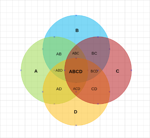
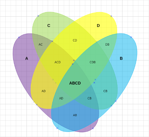
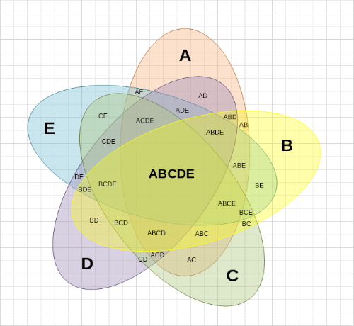
Before we show you real-life examples of Venn diagrams, here are 3 template diagrams demonstrating the different shapes used to make a Venn diagram, as well as few various arrangements. As you will see the first sample diagram is made with circles, which is also the most commonly used shape. Another shape you can often see is an ellipse.
Venn Diagrams can also be made with triangles, rectangles, squares, and other shapes, yet they are rarely used.
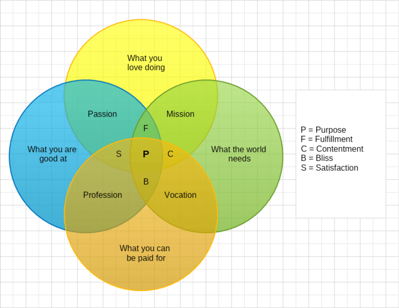
Venn Diagram showing the results of the combination of a few items
This Venn diagram was initially introduced in Forbes as a way to visualize how one can fulfill his life's purpose. If you take a closer look at the diagram you will see that it has four levels: the content of each circle; the results of the combination of each two circles; the results of the combination of each three circles; and finally: the combination of all four parameters. What cannot be described inside the Venn diagram is noted by its first letter and added in the legend on the right.
This is one of the common uses of Venn diagrams. The main parameters vary according to the purpose of the visualization, but the concept is still the same - the places where the shapes meet shows the result of the combination of both items.
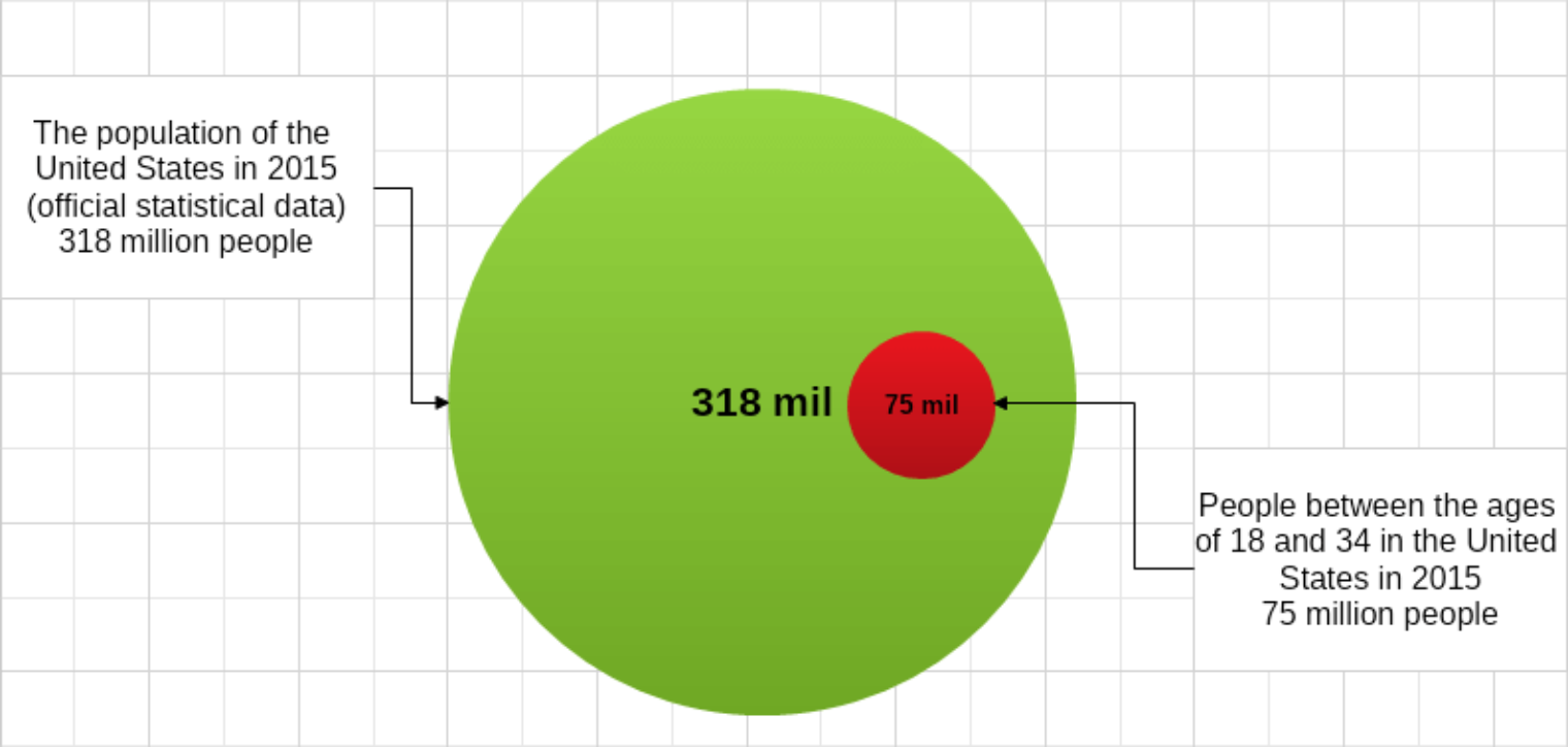
Venn Diagram comparing an excerpt to the whole
A less common use of the Venn diagrams is to demonstrate the contrast of an excerpt to the whole. In this particular situation, we asked the question: what part of the American population are Millennials? After a quick search, we found out that in 2015, the entire population of the United States was a little over 318 million people, and those between the ages of 18 and 34 were 75 million. We created two circles with corresponding dimensions - the diameter of the large one is 3,18 centimeters, and 0,75 for the smaller one.
As you can see the Venn diagram helps deliver a clear visualization of the ratio of both groups.
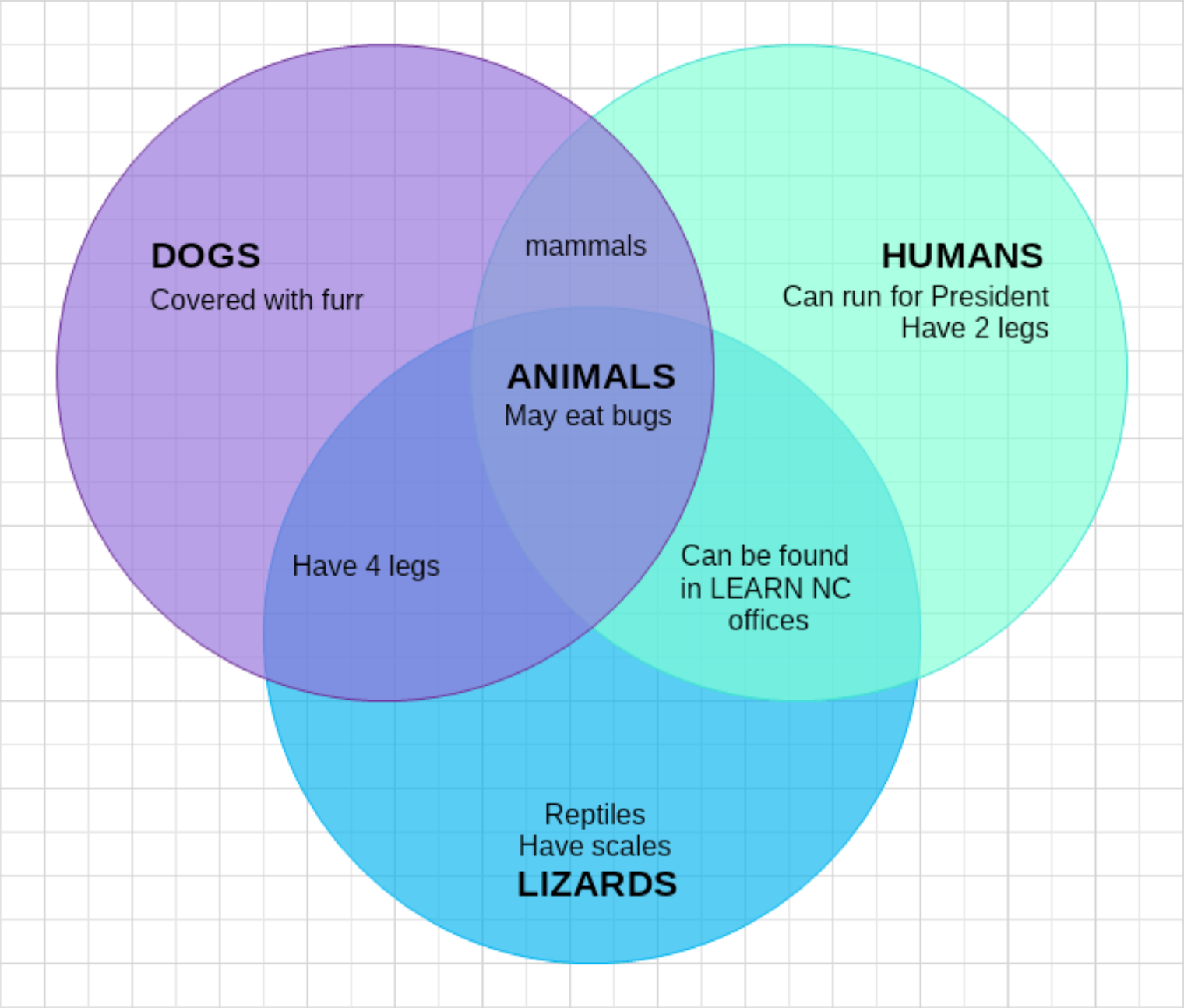
Venn Diagram showing the similarities between items
One of the most common uses of Venn diagrams is for comparing two or more items. When this is the purpose of the diagram, the unique qualities (abilities) of each item are described in the outer circles, and their similarities - on the overlapping part of the shapes. In the below example you can see how dogs, people, and lizards differ, as well as what they're similar in.
Although this is a humoristic example of the use of the Venn diagrams, their application goes far beyond entertainment. Comparison Venn diagrams can be used in HR departments for selecting the better candidate; when picking a university; when a marketing department needs to define the unique qualities of business; as well as in many other cases.